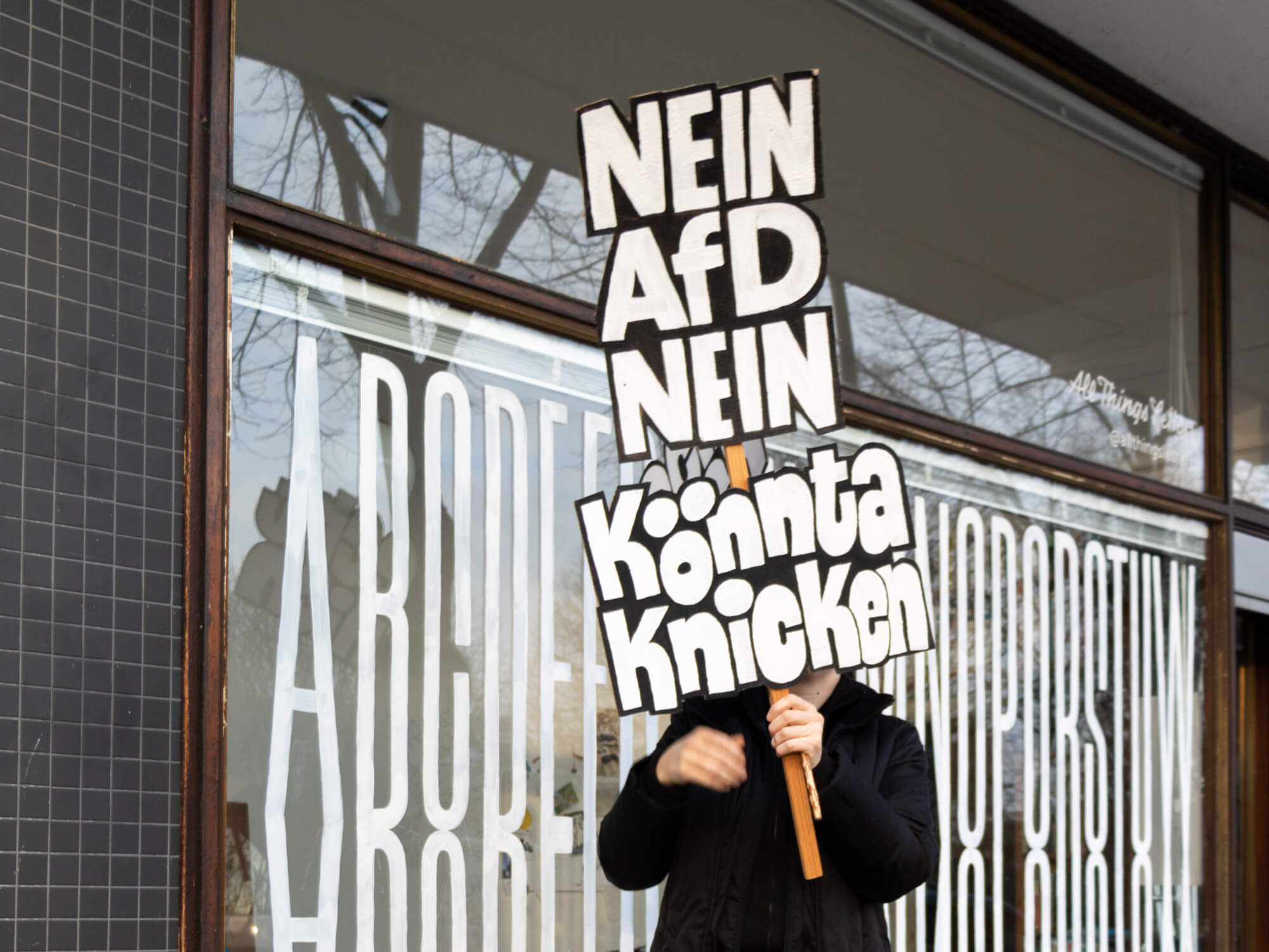
I know, of course, that it should be »keinen Scheiß«, or at least »kein Scheiß«. But the colloquialism is precisely what’s funny about my protest signs and I didn’t want to start fiddling with an apostrophe in this case.
February 29, 2024

Download this free PDF handout!
HOW TO Paint protest Signs
In another blog post I told you how I became a protest sign influencer, in this one I’ll show you how you too can paint demo signs like mine.
Protesting is much more fun with your own sign in your hand. You’ll get a great response if you offer something to look at. A bold sign, maybe even a funny one, gets smiles and thumbs up, it travels around the world in photos and, above all, inspires others to speak out too.
Material
- paper
- pencil or felt-tip pen
- ruler
- cutter
- white wall paint or acrylic paint
- black acrylic paint
- paintbrush
- a stick
- adhesive tape
1. Text Idea
Develop an idea for the text or use a slogan you have seen somewhere that expresses what you want to say.


2. Layout
Break up the text and decide which words belong in which line. Make sure the lines make sense—some words simply belong together.
3. Sketch
Draw a sketch and decide what the individual words should look like. Upper case, lower case, cursive? How bold are the strokes? Are the letters upright or slanted? Are they aligned on the left or arranged around a central axis?


4. Skeletons
Enlarge the sketch on cardboard. First draw a few loose guide lines, then draw in the skeleton of the letters. No ruler needed.
5. Draft
Determine the line width by drawing lines to the left and right of the lines of the skeleton letters. If looks gets too confusing, trace the final lines with a colored pencil.


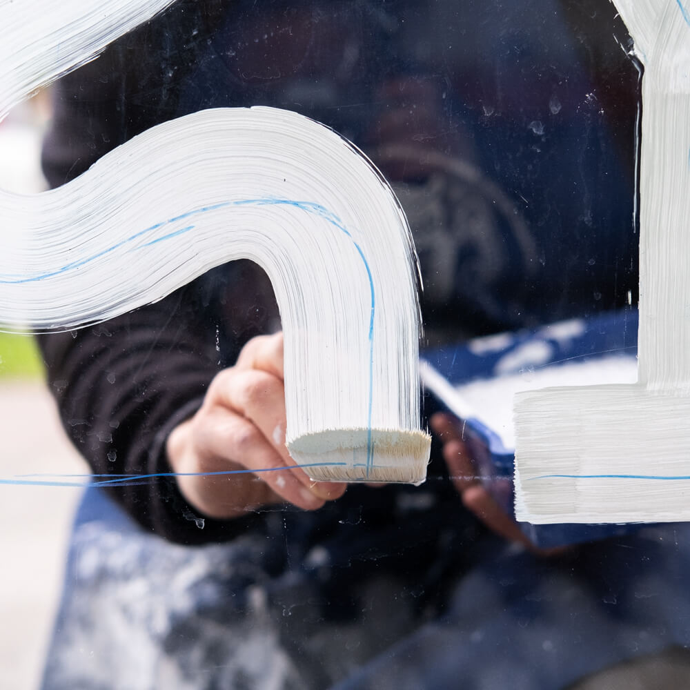
6. Letters in White
Paint the letters with white acrylic paint or wall paint. If you paint with a flat brush, you will immediately have a uniform line width. The shapes don’t have to be neat, you define them in the next step with the black paint from the outside.
7. Background in Black
Outline the letters in black to define their shape more precisely.
You can also paint the letters in black and the background white, but they will stand out much better in white.


8. Endless Corrections
This is the moment to get pedantic and correct the shapes of the letters by going back and forth several times with white and black.
Pro tip:
By cleverly incorporating a capital ß in your sign, you are also setting yourself apart from conservatives in typography, who are of the opinion: »The ß is a ligature of two lowercase letters, there are no words that start with ß, so we don’t need a capital form!«


8. Cut Out the Shape
Cut out the text block, leaving a margin of about 1 cm around the letters. The uneven outline makes your sign even more eye-catching.
9. Tape on a Stick
I don’t have a photo for that, I trust your imagination.
10. Go to a Protest
You can find an overview of demonstrations against the far right on the Demokrateam website.
PS: Send Me a Photo of Your Sign
I really enjoy seeing all the variations and I collect everything that has to do with my demo signs or is inspired by my tutorial. So why don’t you send me a photo of your sign (preferably at a protest) to chris@allthingsletters.com. Thank you!