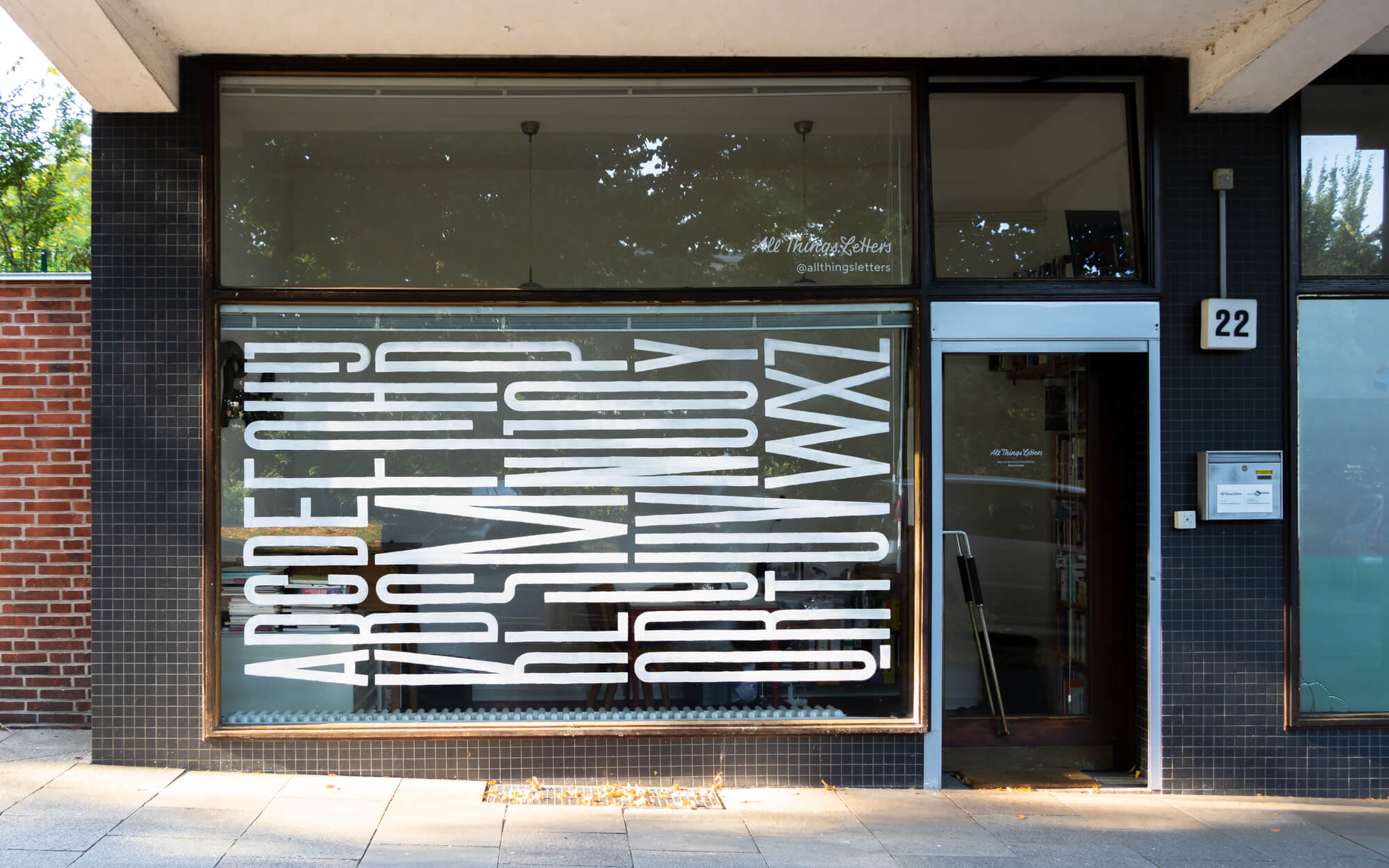
My office in a former shop on Hamburg’s Venusberg has walls on three sides and one side completely made of glass. Since 2018, I’ve been painting the shop window with a new alphabet every few months. The series is called »Window Alphabets«.

Painting Shop Windows—A Step-by-Step Guide
1. Have an Idea
I develop my lettering alphabets by constantly drawing in my sketchbook. Every once in a while, I come up with ideas that I’d like to see in large or that would make a great showcase alphabet.
2. Work Out the Design
When I have found an idea, I draw a draft in the proportions of my window. I draw the design about the size of my hand and work it out in several steps on tracing paper.


3. Prepare the Sketch
I draw a grid over the sketch, and on the window to transfer the drawing more easily.
4. Clean the Window from the Outside
I wet the previous alphabet with warm water, wash it off with a sponge and remove paint residues with a scraper. Then I clean the window with window cleaner, because once it is painted, cleaning it would damage the paint.


5. Draw the Guide Lines
Using the grid on my sketch, I calculate the space between the guide lines. I measure them out on the window pane and make marks with a crayon that writes on glass. Then I use a chalk line to draw the guide lines on the the glass.
6. Sketch the Alphabet on the Inside
I make the preliminary drawing on the inside with a colored pencil that draws on glass. I draw freehand with the help of the grid.
photo: Hari Klein


7. Paint the Alphabet on the Outside
I paint freehand on the outside of the window with white acrylic paint. For most alphabets I use a flat brush. I use a scraper with razor blade to make corrections. I paint in white because it is best seen on the dark background of the room.
8. Clean the Window from the Inside
At the end, I remove the preliminary drawing and clean the window on the inside.

Ligature Alphabet, 10.2018

Frakturphabet, 6.2019
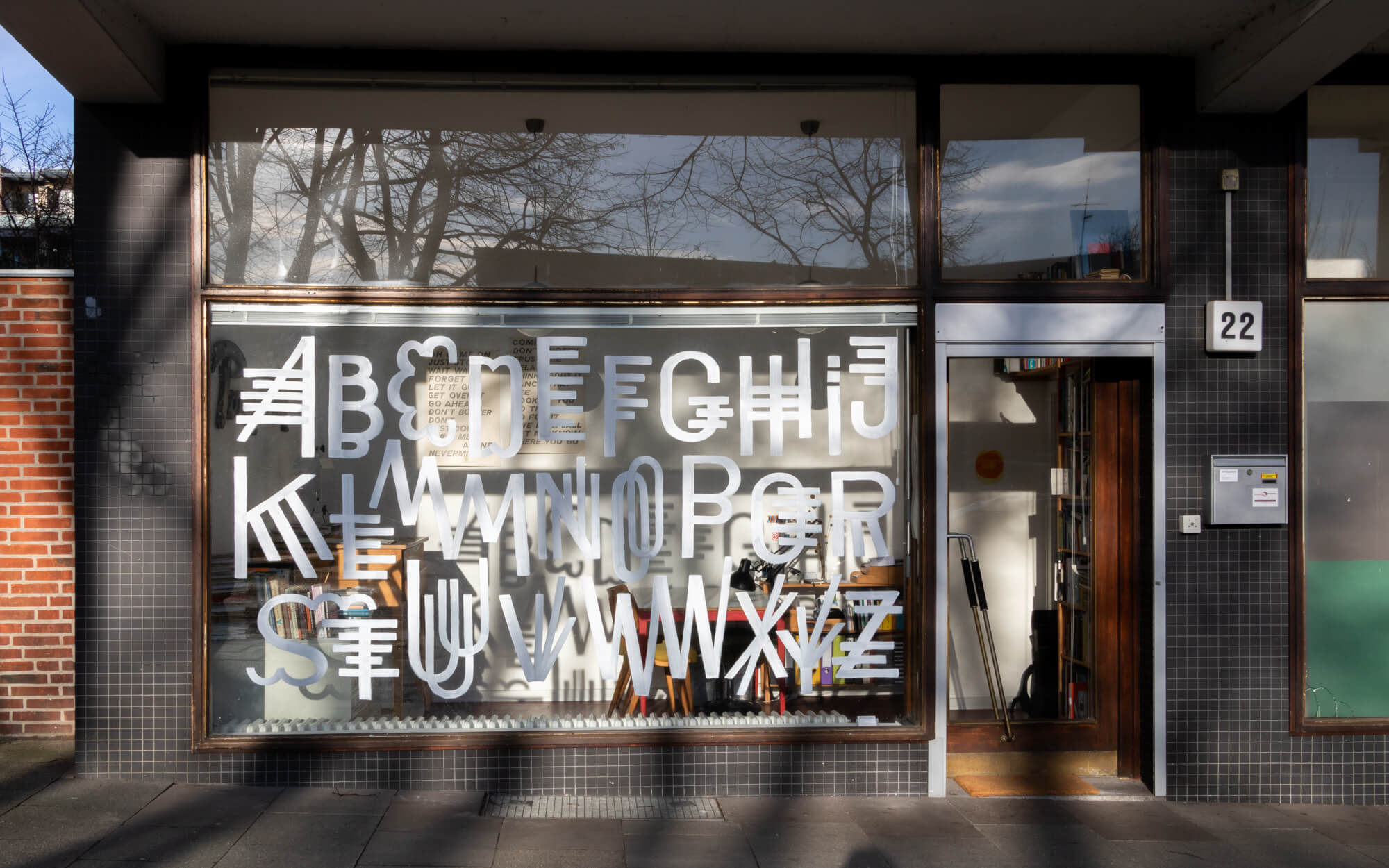
Weirdphabet, 12. 2019

Monoline Condensed, 3.2020
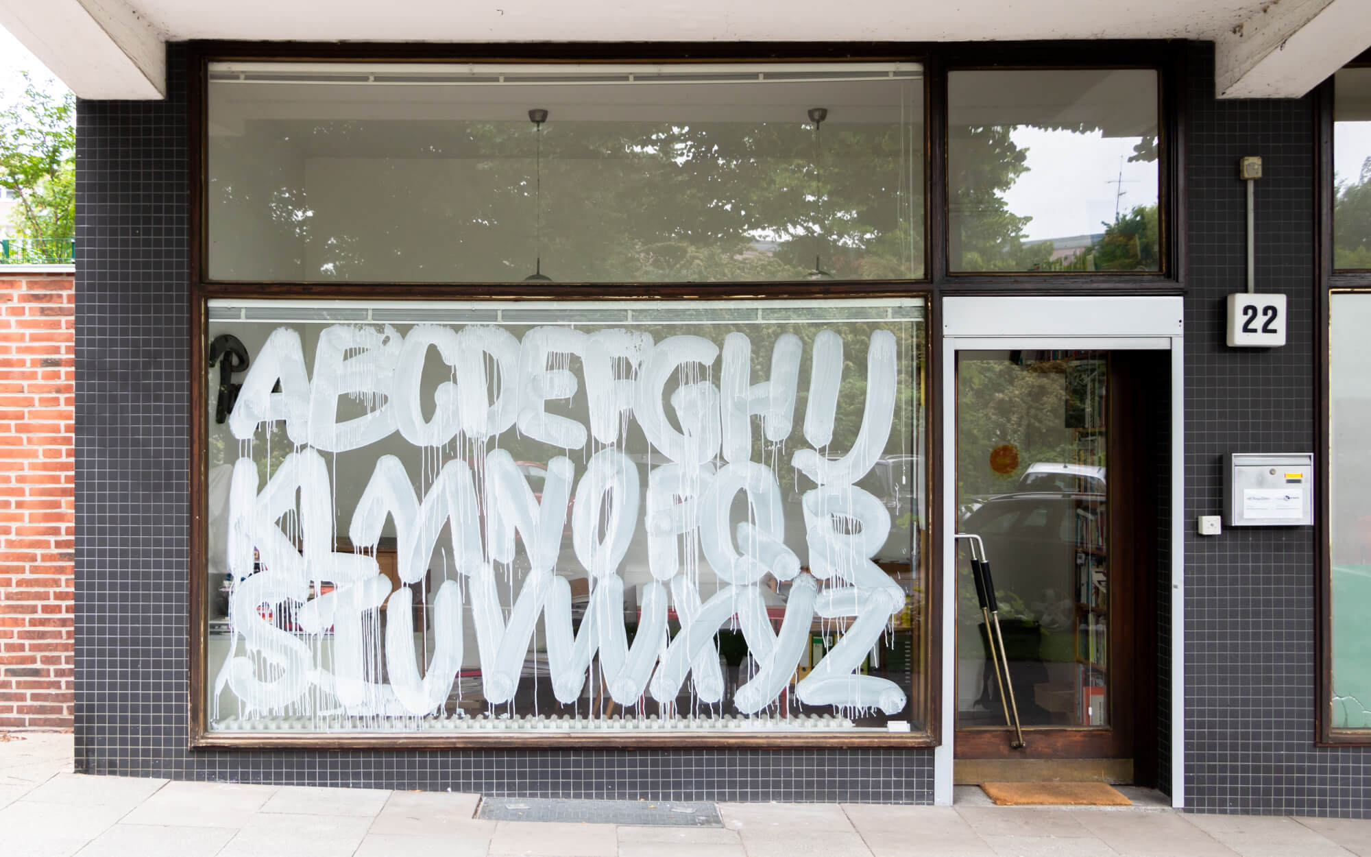
Dripphabet, 5.2020
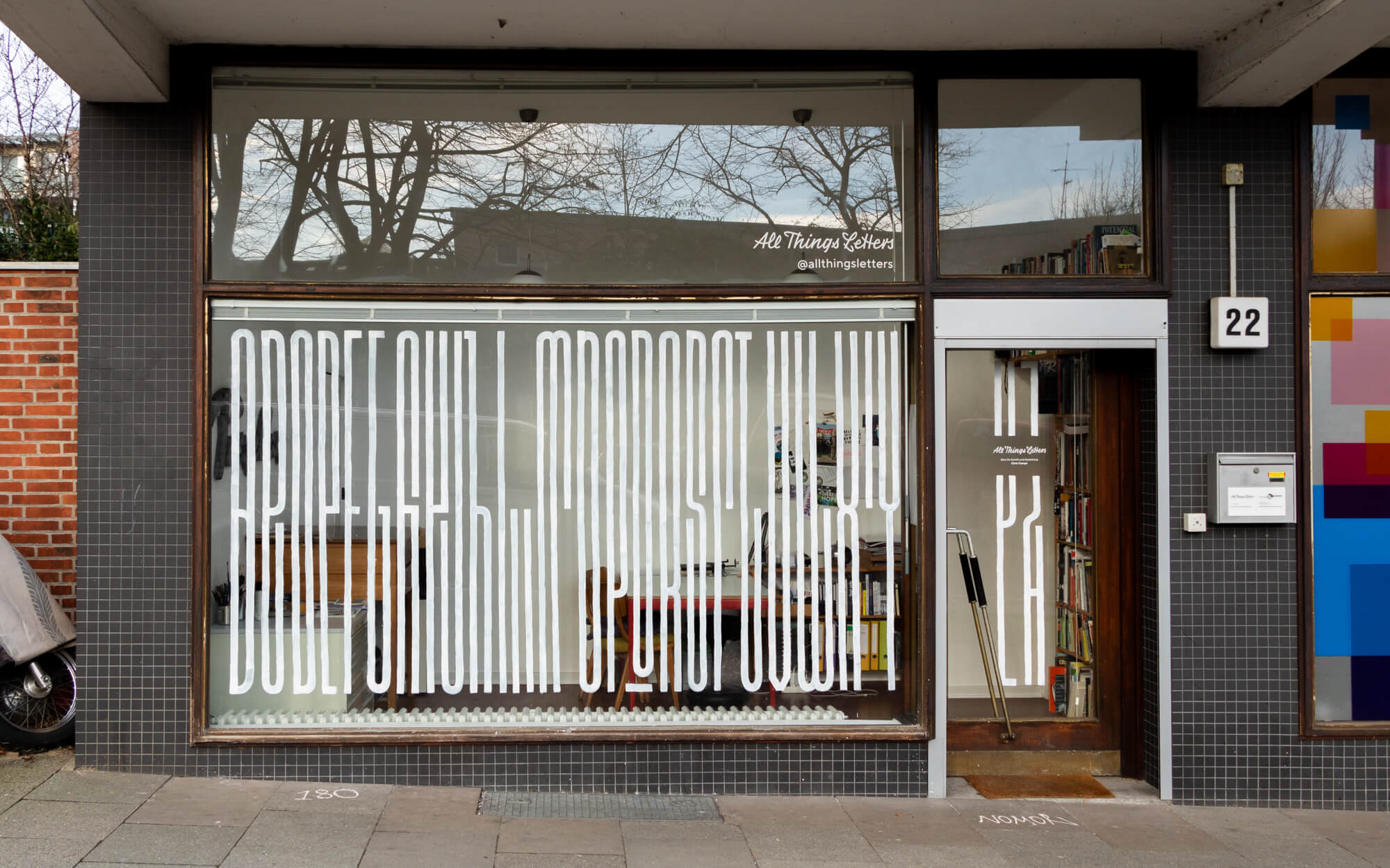
Horizontalphabet, 8.2020

Snowballphabet, 12.2020

Patternphabet, 3.2021
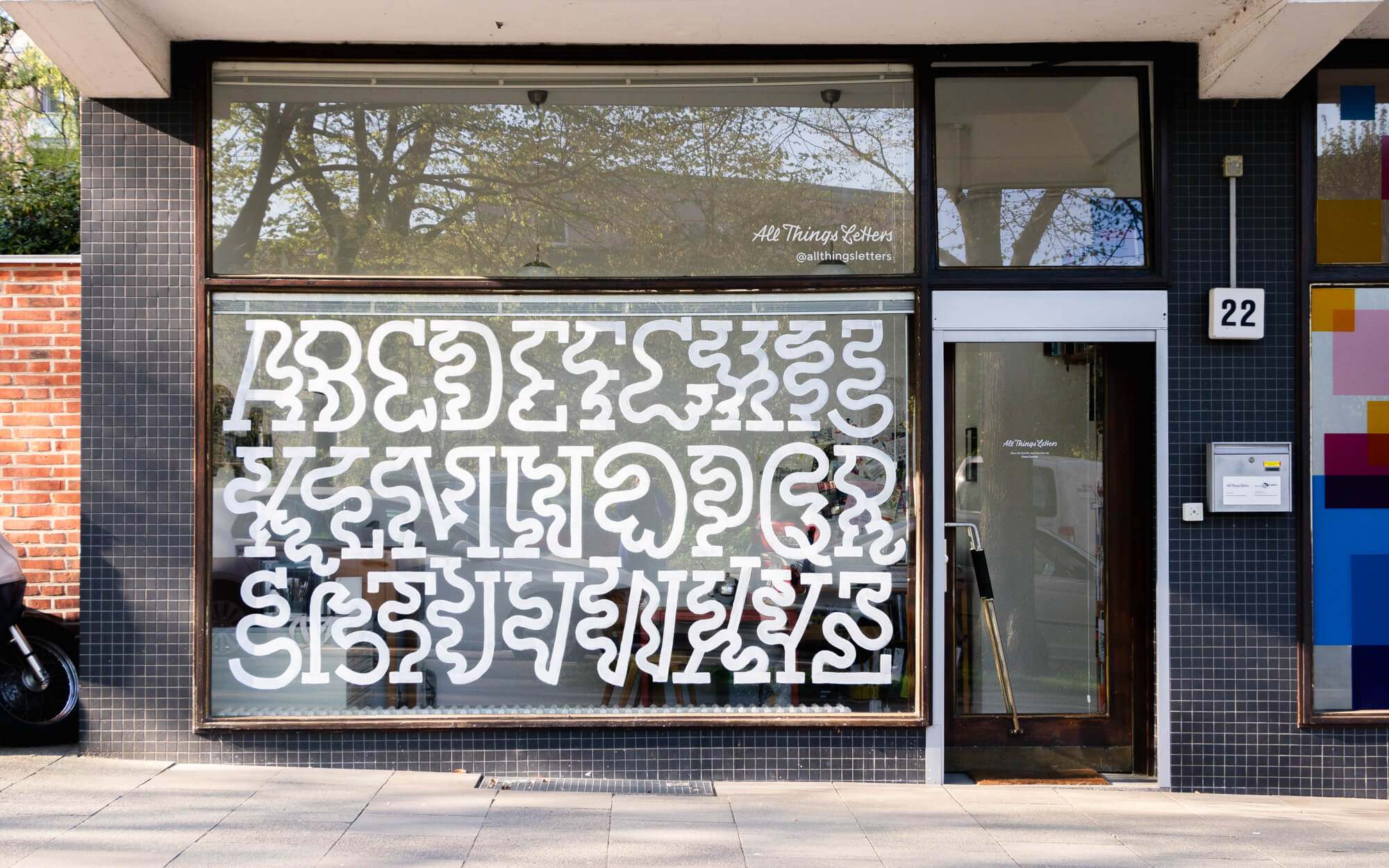
Wobblephabet, 04. 2022
Scratchphabet, 12.2022
Halphabet, 1.2023

Flipphabet, 10.2023

Negativespacephabet, 7.2024